JBL Masterclass
Concept #1
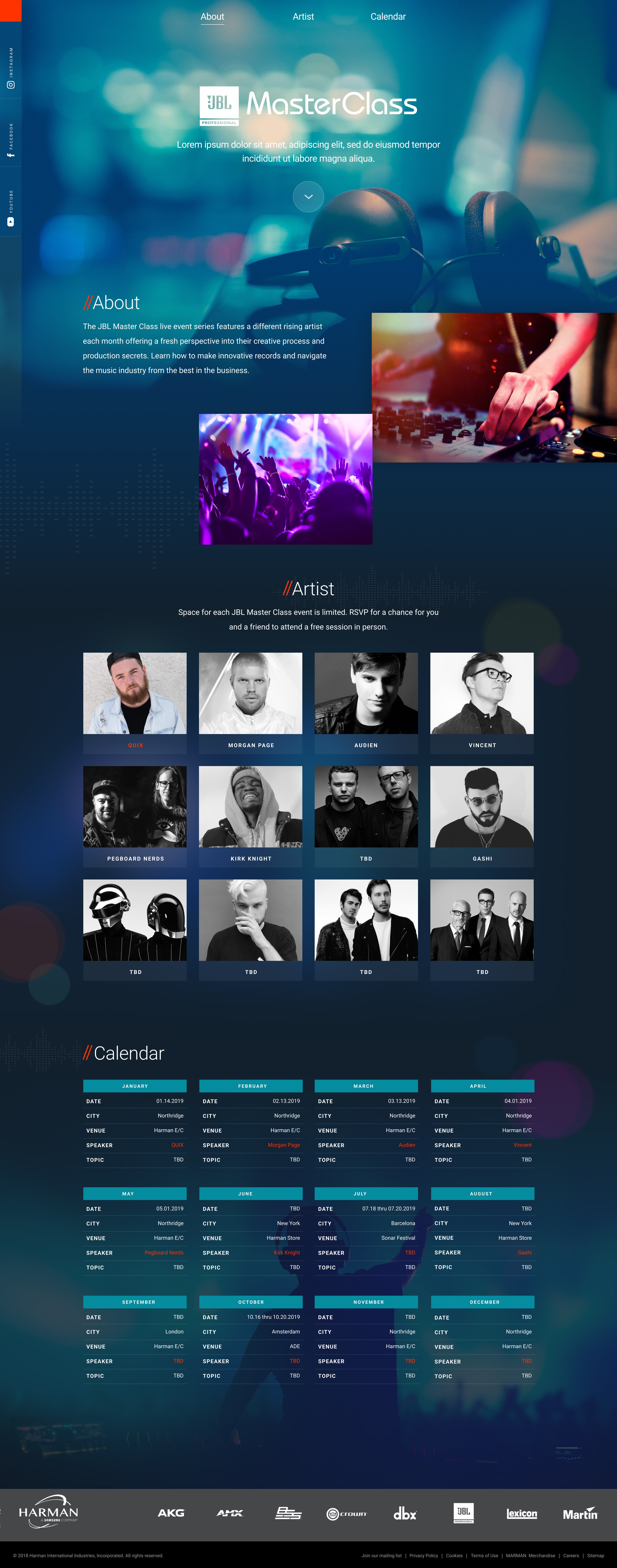
The landing environment had flashy design yet, remained user-friendly, allowing visitors to explore featured artists, stream their music on Spotify, and learn about upcoming events in the series.
The comps include placeholder text (Greek) in some areas. Following design approval, the work would undergo copywriting, active news stories and final image selection(s).
Mobile screens
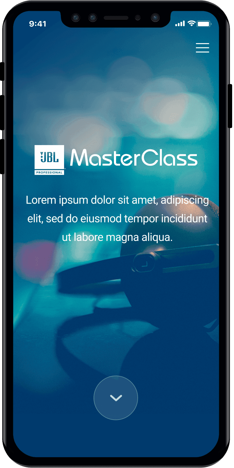


Concept #2
This was the second landing environment shown to client. After a few rounds of logo designs, it was sent to production and later launched for the series debut.

Mobile screens


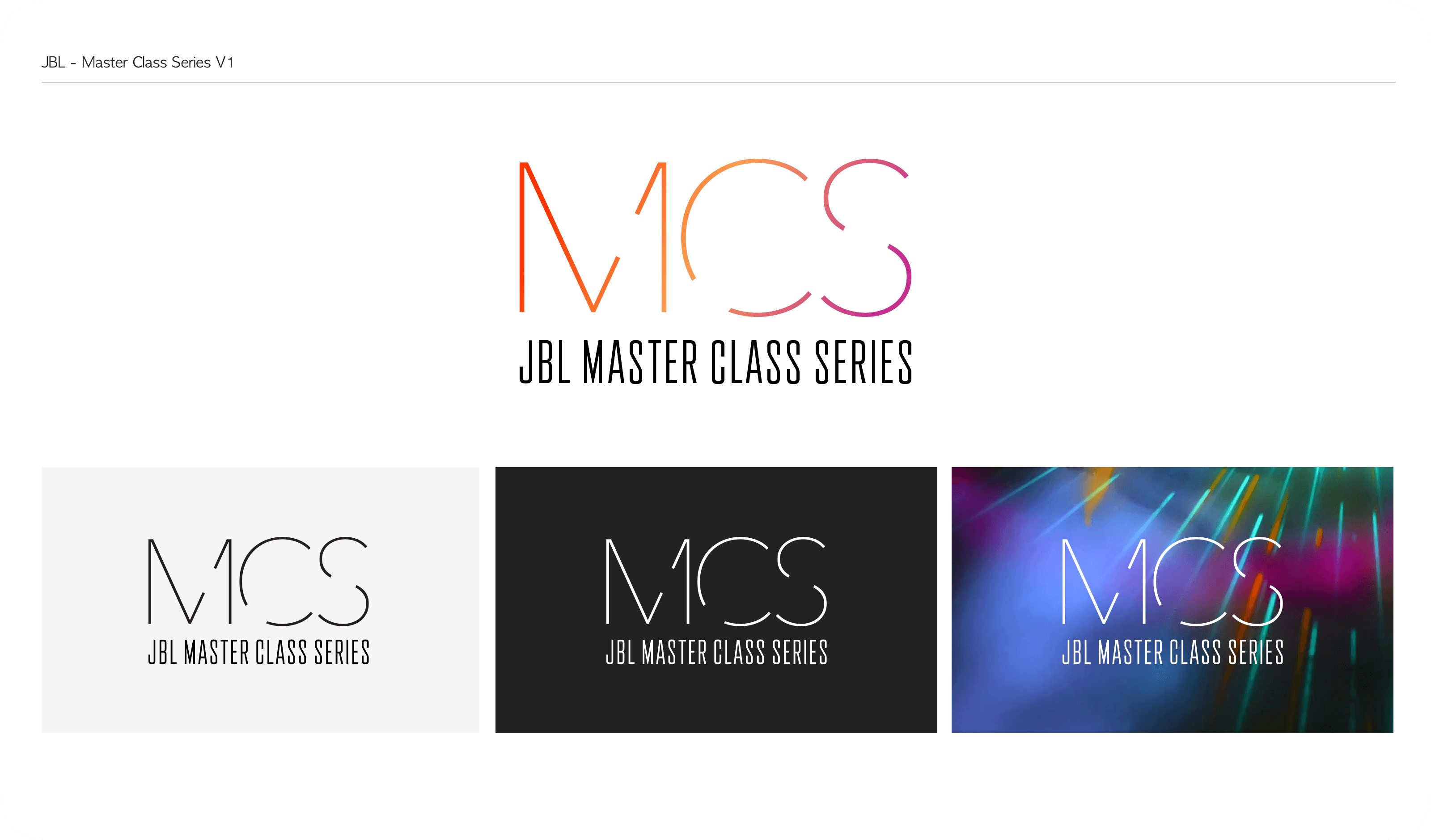
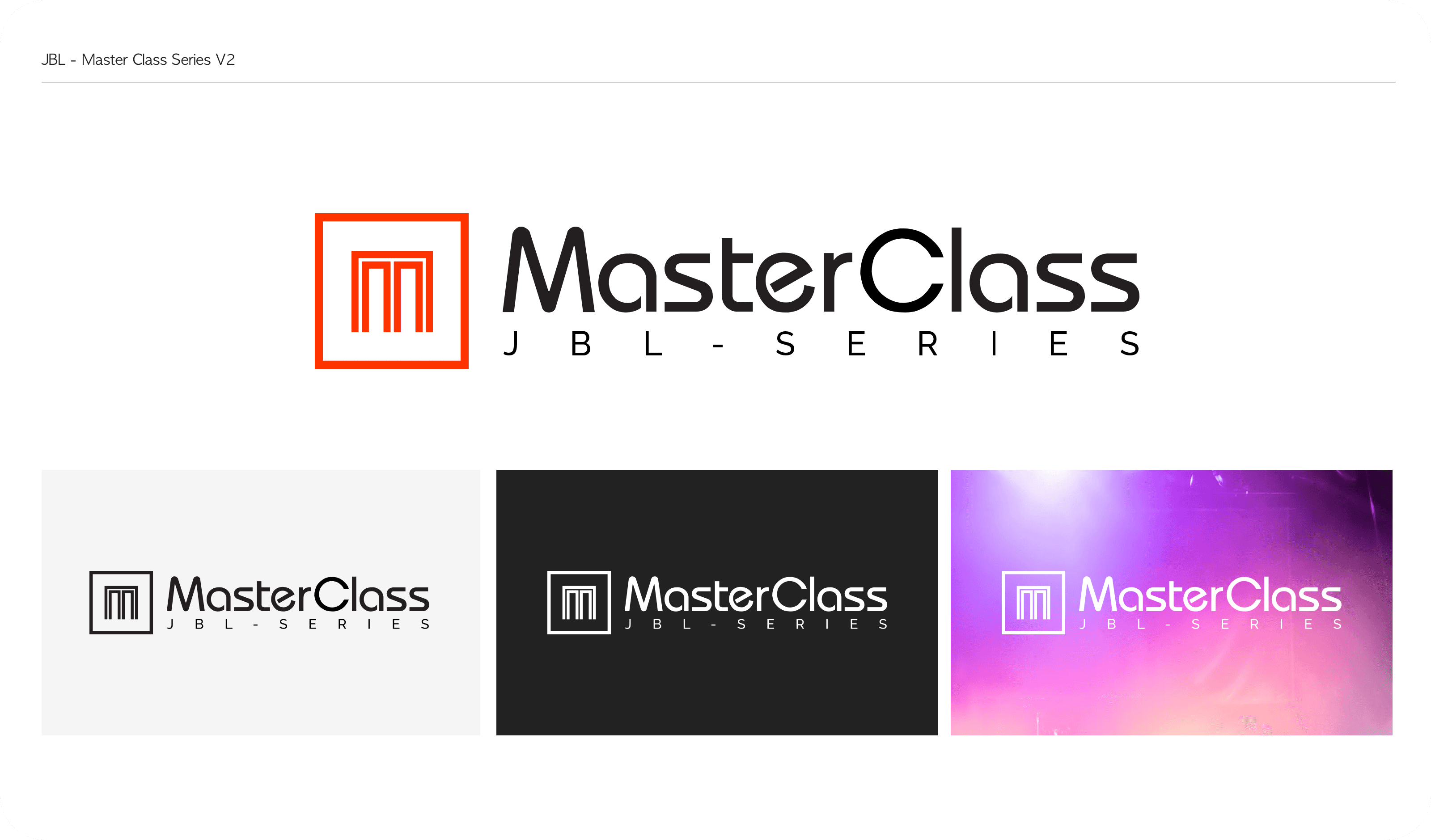
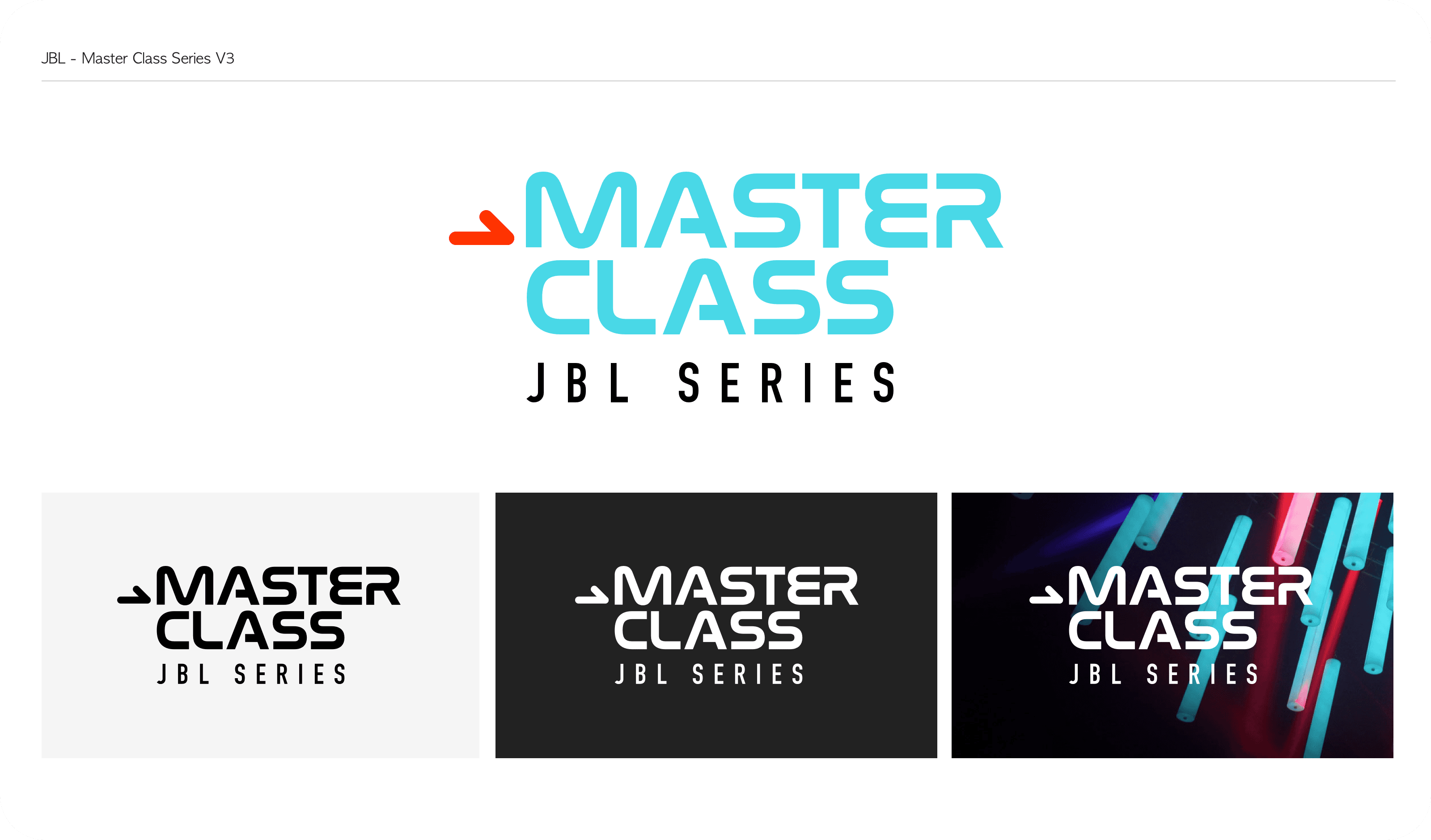
Logo concepts
While the chosen logo is shown in the comps, I presented 3 other versions to the client. Ultimately, they wanted to make sure the OG JBL logo was displayed alongside of MasterClass.
