MacSales / OWC
Project:
Website, Brand refresh
Role:
UX/UI, Visual
Agency Partner:
Direct Client
Homepage
Starting from the top, the header was completely revamped and given a hierarchy of information. With more consise tabs it made it more clear to users where to shop and where the get help. The body of the page features a mix of product tiles and lifestyle photography featuring new items. Lastly, working closely with the marketiing team, the wall of ads and screaming sale items were removed to elevate the companys reputation and step away from the Harbor Freight approach the company had always gravitated toward.

See the original macsales.com homepage. »
Used macs
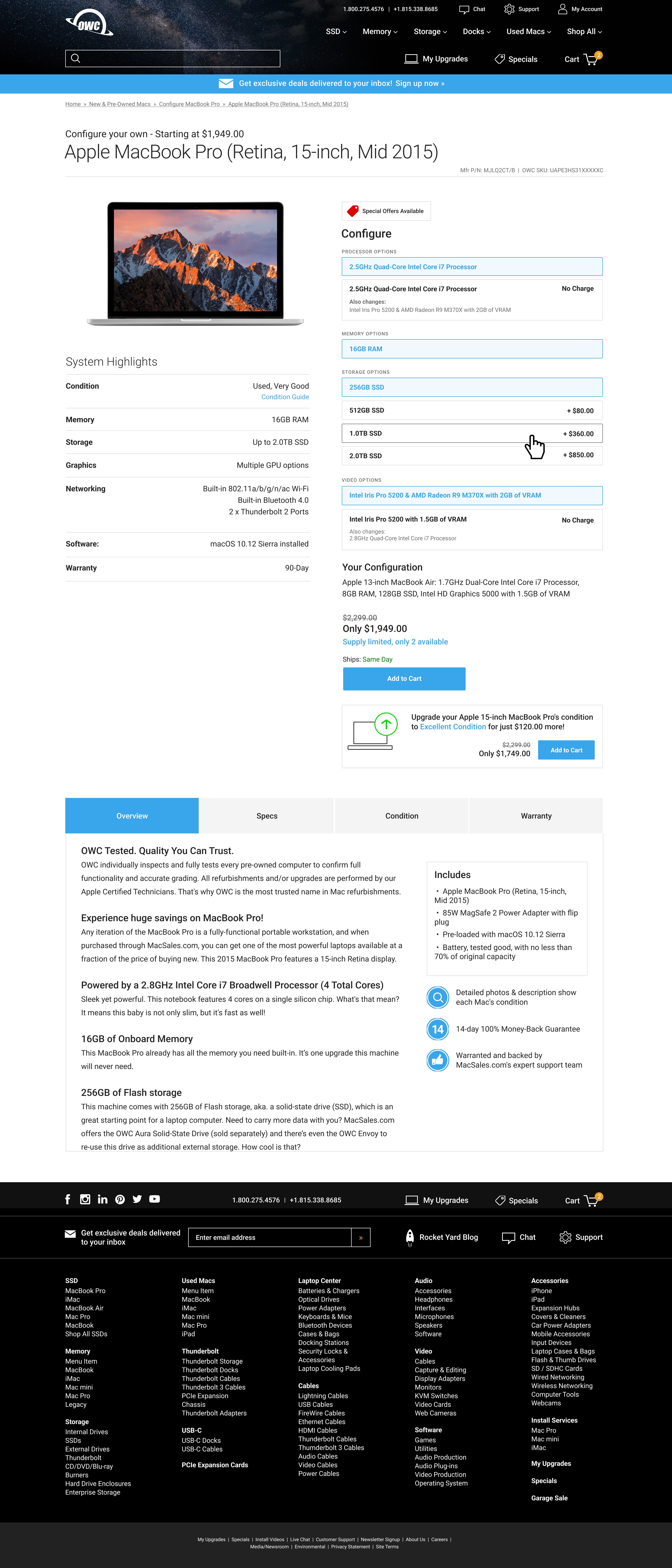
Screen 3 of a 3-page process. This page assumes the user has selected a specific computer and can then select available options and reconfigure accordingly. This approach was greatly streamlined from it's previous versions.

Product page templates
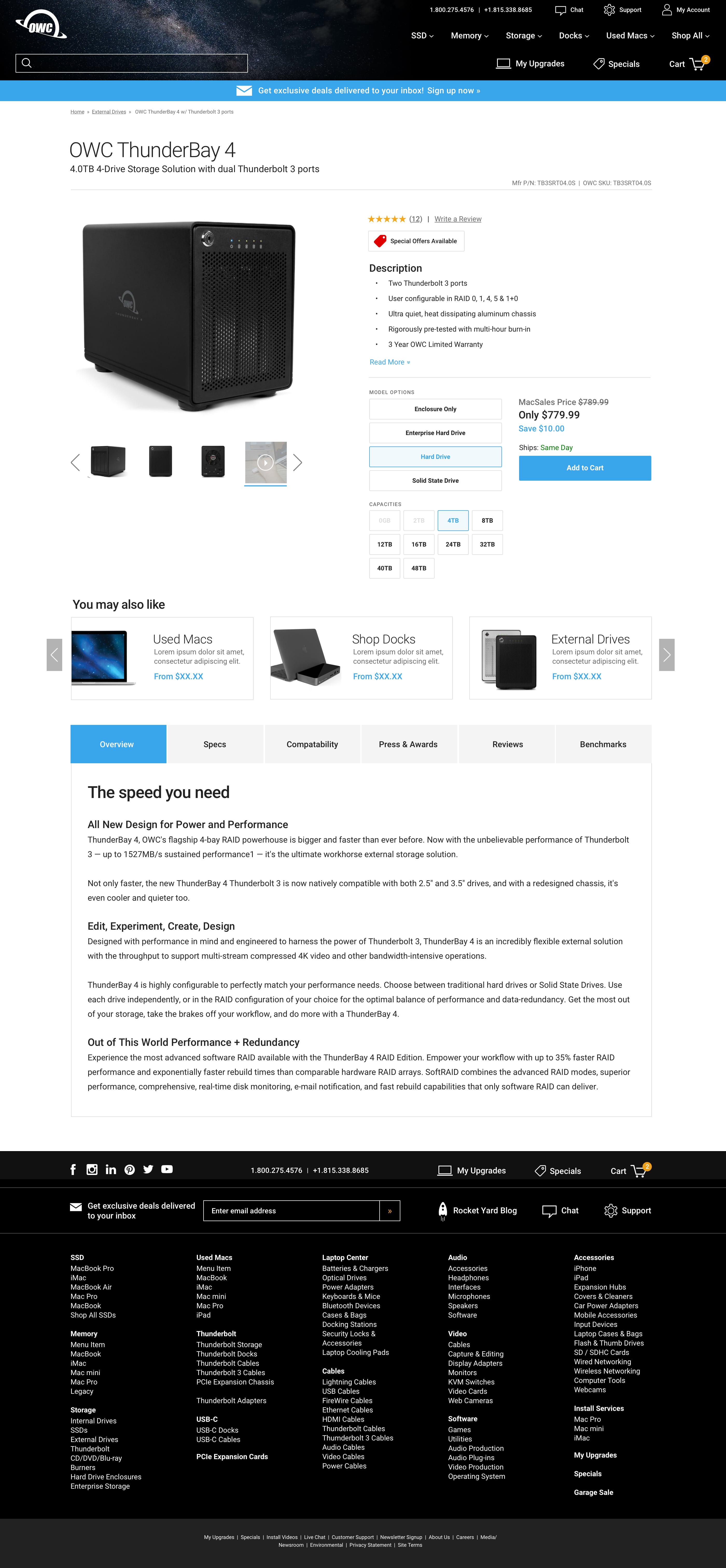
The existing product pages on MacSales.com didn’t have well-defined areas for content or a uniform way to feature products, pricing and detailed descriptions. To reinforce user expectations, I redesigned a more predictable approach, not unlike most retailers today.

Mobile screens
Without an existing mobile experience in place, I made sure all pages truncated nicely as screen sizes became smaller. Users could now shop from mobile devices without having to pinch and zoom on full size web pages.


