Mount Sinai

Mount Sinai Health System, is a large healthcare provider in the New York metropolitan area. I was involved in helping define the “Ideas Nertwork” which helps bring together their internal resources with external clinicians, scientists and industry partners. The website was built to inform and highlight these game-changing advances within the healthcare industry. I worked closely with the UX team at PaceCo to bring their UX efforts to life through branding the experience and helping tell the story visually.

Mount Sinai Health System, is a large healthcare provider in the New York metropolitan area. I was involved in helping define the “Ideas Nertwork” which helps bring together their internal resources with external clinicians, scientists and industry partners. The website was built to inform and highlight these game-changing advances within the healthcare industry. I worked closely with the UX team at PaceCo to bring their UX efforts to life through branding the experience and helping tell the story visually.

Project:

Website

Role:

Visual, UI

Agency Parner:

Homepage

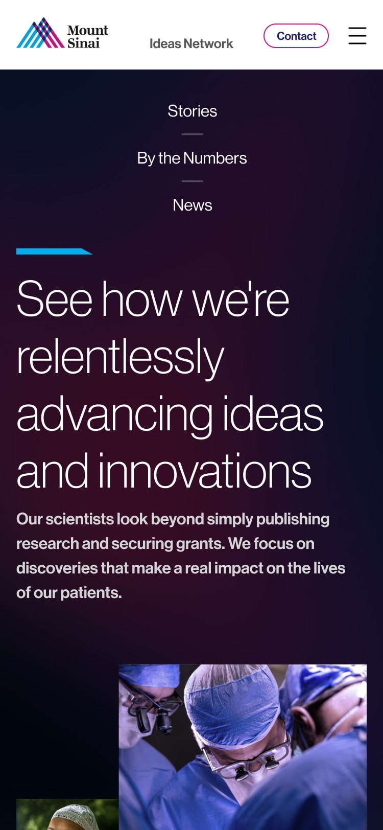
The long homepage was designed to give a snapshot of all areas within the site.Through photography and illustration, I was able to advance the Mount Sinai brand to a more modern, sophisticated level. The magenta illustration was used site-wide to lead users from one section to another as they scrolled the long story-telling pages.

The comps include placeholder text (Greek) in some areas. Following design approval, the work would undergo copywriting, active news stories and final image selection(s).

Stories

A large part of the site was telling actual stories around the partnership between Mount Sinai and external partners. Highlighted are Renalitix ‘s efforts to eradicate kidney disease and Monogram’s disruption in the joint replacement space.

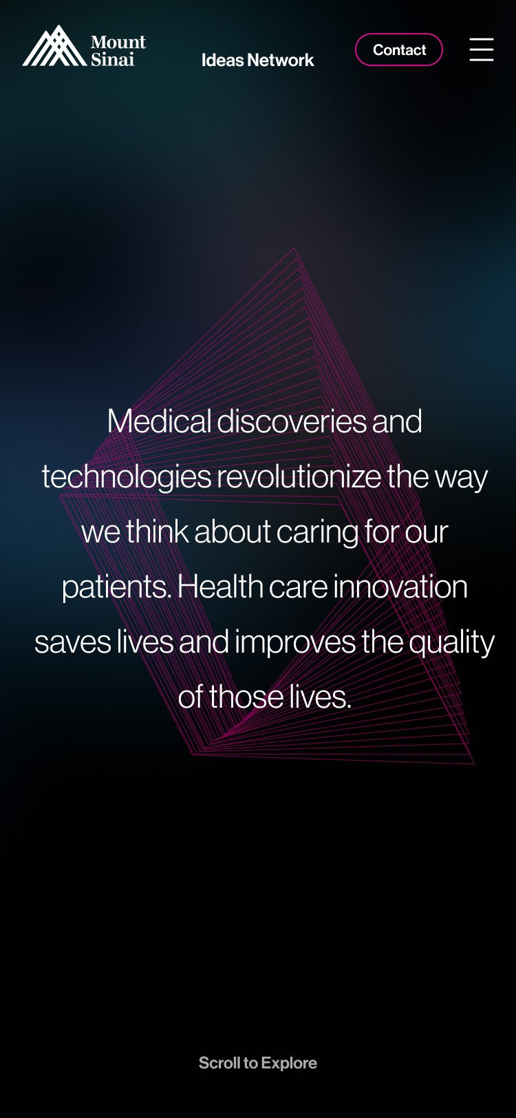
Homepage intro sequence

Early in the project, the homepage featured an animated sequence which sat at the top of the homepage as a means to tell a brief introduction to the Ideas Network. The magenta graphic would always be in motion, and used as a trnasition between screens of copy. Shown are the static desktop visual along with the mobile storyboards.

Landing page

The mockup below shows a key landing page where users can view products, status and detailed descriptions within. The UX team designed this clean “card” system making it helpful for viewers to capture key information at a glance.

Mobile Screens

Jeff_McAllister

Sr. UI/UX & Visual Designer

Austin, TX | San Diego, CA

© 2024 The Design Standard LLC. | Jeff McAllister. All Rights Reserved.

Jeff_McAllister

Sr. UI/UX & Visual Designer

Austin, TX | San Diego, CA

© 2024 The Design Standard LLC. | Jeff McAllister. All Rights Reserved.

Jeff_McAllister

Sr. UI/UX & Visual Designer

Austin, TX | San Diego, CA

© 2024 The Design Standard LLC. | Jeff McAllister. All Rights Reserved.